Tuesday, May 17, 2011

Pot Casse

Over the course of last week, we went over a lot of works that had to do with printing. From its beginnings in Germany with Gutenburg, the process seemed to evolve more and more as time went on to the Renaissance in some major parts of Europe.

One piece in particular caught my interest while in class. That was the Pot Casse designed by Geoffroy Troy. Now, it's not so much the image in particular, but the meaning behind this design. Troy, having lost his 10 year old daughter, dedicated this piece to her in memory. Upon the image, you can see it bears the words 'non plus' which means "no longer" or "nothing more".  It didn't seem to be too common of a thing for a person in these earlier times to dedicate such a wonderful piece to someone. It's kind of nice to see something that was done to honor the memory of another.


What I find interesting is the use of symbolism in the image. Take for instance, the jar with a crack on it. This resembles the body. Perhaps this is similar to the Sumerian's use of Ideographs to convey a message. It's funny how you never realize until you really look into these sorts of things how much our roots of art are taken from older civilizations. I wonder if the designers and artists of this time ever pondered about this.

Wednesday, May 4, 2011

Creative Brief #1


Identification: The Phaistos Disk was found in 1908. Unfortunately, the creator of the Phaistos Disk is unknown. However, according to the text book, it dates back to around 2000 BC. This being the time of the Bronze Age for the Minoans living in Crete.

The Project and Problem: This disk, made out of clay, has two sides with 241 different signs. Each a pictograph or alphabetic form representing something different.  Stamps that had a type like form were used to impress the characters of each into the wet clay. No one knows for sure if the stamps were used on such things as papyrus and other perishable goods due to age, but at least this was a start for what later became the alphabet we use in our language today.

The Client: It is uncertain if anyone even hired the person to do this, but I'm sure it probably was either a ruler or some sort of priest that might've requested this as a way to develop a system of possible communication or something of the sort.

The Intended Audience: At the time, this was probably reserved to those of higher nobility. After all, commoners at the time weren't allowed to learn knowledge like we do now. So, most likely this disc was reserved for the ruler and some of his more higher subjects. It pretty much just depends on the position they had at the time.

The Core Message: Basically this was to design the disc as a system. Like our alphabet today, this disc was used as a way to form thoughts and verbal speech into words so that there would be a way to communicate with others besides talking to one another.

The Outcome: To establish written communication between others. The 'client' most likely wanted this as not just a way of communicating with others, but to also document information. For example, the Book of the Dead was used as a way to illustrate the Egyptian process of mummification as well as the after life with letter form and image.

The Graphic Strategy: The designer used ideographs and petroglyphs to create the symbols on both sides of the disk so as to create the system as mentioned above. Using a tool of some sort, they cared it into the clay as a way to establish these letters and create an alphabet of their own.

Book of the Dead

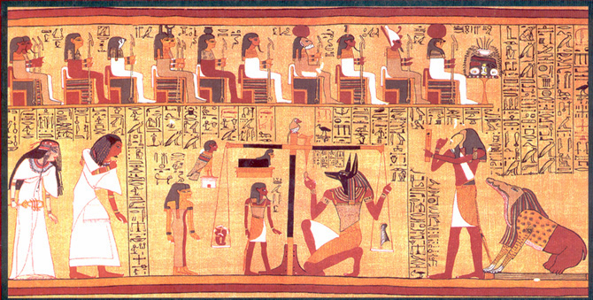
One work in particular that caught my eye in Tuesday's class this week was the Vignette from the Papyrus of Ani. Which is a piece found within the book of the dead. I did a bit of research on this piece to get a better understanding of what exactly is going on.


According to http://www.egyptartsite.com/ani.html, this series depicts the Egyptian ritual of mummification. In particular for this piece, it was for the royal scribe, Ani. Since, after death, the person was supposed to travel to the afterlife after they died. The body was an important part to this process, so they had to preserve it for eternity in order for the person to be able to successfully travel to the afterlife.

Now onto the main topic at hand.  You'll notice there is a figure close to the center bottom on the left side that has a jackal shaped head. That is Anubis, also known as the Guardian of the Afterlife. Anubis actually has been used several times in our current culture. Hell, they've even used him in a few movies and video games.

But the sad part about this is that usually when something is taken from the past and recreated into something for present media, the people who recreate it usually change what the icon formerly was and make it into something that it wasn't. Anubis has been made into an antagonist at times and although he's still given the job of dealing with the afterlife, he's sort of made out to be this bad guy. When really, the Egyptians honored and respected him.

If anything, I'd sort of like to relate this to Hades who was, in Greek mythology, the ruler of the Underworld. Now, as some people might know, Disney created a movie called Hercules. This movie depicted Hades as a bad guy. Funny enough, Hades wasn't really all that bad. If you want a real shocker, you should read up on Zeus. You'll definitely see him in a new light after you read up on what really happened.

Point is, it seems over the years, different iconic characters start to develop different backgrounds if one generation is inspired by another. This isn't always a bad thing, but it is sort of a shame since the old icon starts to lose it's meaning. But, I suppose that just gives people all the more reason to research the history of certain subjects.

Tuesday, November 30, 2010

Pattern Project

Pattern done for class made from a grid of 30 squares of positive, negative and manipulated versions of the same image.

Wednesday, November 17, 2010

Thursday, November 4, 2010