Thursday, June 30, 2011
Creative Brief #3
1. Identification: Signage symbol system designed by Roger Cook and Don Shanosky in 1974.
2. The project and the problem: The project was to create a set of symbols that the U.S. Department of Transportation could use to simplify messages to international travelers so that they could better understand what something meant through the use of pictures rather than words.
3. The client: The U.S Department of Transportation had commissioned the American Institute of Graphic Arts or AIGA, Cook and Shanosky were students at the time and their design was the one chosen out of all of them.
4. The intended audience: Somewhat more so for international travelers, most likely due to they might have difficulties understanding the English language, so the pictures helped more so than words. However, it was also a system for American travelers to understand as well due to the fact that the pictures made good use for the public transportation systems.
5. The core message: A simplified number of pictorial images used to establish what something is without the use of words. Symbols that could be used around the country for everyone to understand so as to make things easier. Each symbol has a different meaning that people will learn to associate with the picture.
6. The hoped-for outcome: The U.S. Department wanted the symbols as a way to communicate instructions quickly and easily. I'd say it was pretty successful considering we're still using symbols as a way to symbolize certain objects. Hopefully international travelers also feel a bit more at ease when using this system.
7. The graphic strategy: The designers basically simplified the signs by creating small pictures of the object it was to represent. They also came up with some original ones like the warning/"No ..." signs. There's also the change in color. Most of the pictures are black, but some of them were given a red color instead.
Monday, June 27, 2011
NeXT Trademark
The NeXT Trademark by Paul Rand. The thing I find most interesting about this one is that it seems to be the only one he did on what could be considered a Third Dimensional Plane. All of his other logos, as seen in the text, are 2D and consist of either being on a flat shape or just the text.
With the exception to his IBM logos, he seems to enjoy using sans-serif text. Although the color isn't consistent. I wonder what got him to decide to use the specific colors that he did? Perhaps it had something to do with the companies colors? Or perhaps he wanted to try something new. The same could be said for the square. Why did he feel the need to put it on a 3D plane? Perhaps to catch the interest of the viewer or make the logo as a whole look more compelling.
There's also the question of why he decided to make the text big enough so that only two letters could fit on each row and make two columns of text instead of decreasing the size so that it could fit as one whole word. Perhaps he wanted the text to reflect the square shape or he just thought it looked better than keep it all bunched in one word and leave all of that negative space around it. The box is also at quite an interesting angle. Perhaps this was to emphasize the box on a 3D plane or the angle is used as a way to connect your eye to the text.
Tuesday, June 21, 2011
Nazi Brutality
Through all the time I've learned about what happened to those in countries close to Nazi Germany and even in the country itself, it's always hard for me to grasp the fact that people would actually do this.
This poster is just another show of how gruesome the world can be sometimes. It directly tells you the events of what happened to those people living in Lidice, Czechoslovakia.
The designer, Ben Stahn, has portrayed the ominous events perfectly. The head is concealed to give the tone an even more darker tone. It makes me wonder if we even want to know what the person's face looks like underneath. The hands are shackled, a clear sign of their freedom taken away.
What's even more sad though is the summary of what happened in the village. Think of all the families that were separated. The children that were taken away no longer had parents due to the father was already dead and the mother would most likely be joining him soon. It's just beyond me how humans can do this to their own kind. And for what? To prove that there's a superior race of humans? There's no such thing as a superior race!
Thank god people have the right to express themselves in most places. If it weren't for the designers, we never would come to fully understand just how painful the events were around this time. Designers after all make you feel something or express their ideas visually through a powerful message. That's the way I see it, anyway. This is why these posters are so important. We come to sympathize with the victims.
Monday, June 13, 2011
Broom
Broom cover by Lissitzky has a wonderful design, in my opinion. The use of grid really does show how it helps to make the letters and numbers show up evenly and orderly on the page. I also really am captivated by the way he gave the letters a sort of 3D effect. Nowadays, we could easily set this up using one of the programs on the computer, so the fact that he did this by hand makes it that much more impressive.
I also really like the way he has the word upside down on one side so that even if you have it upside down, it still looks the same. I'll admit, I've never been one that was fond of using grids simply because it feels like it's just a hassle and makes the work take longer, but to see that you can get a result out if it by doing something like this, I feel a little more inspired to try and use grids for some of my works in the future.
Another interesting fact about this piece is that, according to the text, Lissitzky was rebelling against metal typesetting due to the constraints it placed on the work, so he'd use instruments for drafting and paste-ups to design his works. It seems he was trying to get away from Gutenburg's process of printing, due to the fact that later on it was being used less and less.
The only thing that disappoints me a little is that he decided not to use any color for it. It's pretty much fine as it is, but it would've been nice had he 'beautified' it a little. Although, supposedly, he didn't like decorating covers, most likesly so that your eye would be drawn more so to the focus of the cover. Which is understandable considering sometimes color can be a distracting element in a design.
Thursday, June 9, 2011
Creative Brief #2
Identification: USA bonds poster created by Joseph C. Leyendecker in 1917. Leyendecker was a popular illustrator at the time and was rather well known for his posters.
The project and the problem: Leyendecker was asked to create a poster that honored the role of the boy scouts for the Third Liberty Loan Campaign. He was to design a poster that beautified the role of the boy scouts and, in some cases, the army.
The client: Third Liberty Loan Campaign. It's not specific on who the person was that commissioned it, but it's probably safe to assume that it was someone in charge of the event. Could've even been a Scout leader for the boy scouts or, most likely, someone higher up.
The intended audience: The boy scout groups all across of America. Basically, it was generated at males, at the time. Those who might have been looking for some purpose in life or wanted to make the country a better place. Those that felt patriotic and wanted to do what they could to help service their homeland.
The core message: To honor the boy scouts and to give the public a sense of pride of the soldiers. Lady Liberty is also standing behind the boy to relay the patriotic theme of freedom. Also, it was a method of creating symbolic characters to represent the theme of the poster.
The hoped-for outcome: To give people a feeling of patriotic pride and to convince the public that we need to fight in order to maintain the freedom of our country. In other words, it was sort of a way of convincing males in general to join the boy scouts or army.
What is the graphic strategy: Lady Liberty was given a somewhat idealized image, as well the boy scout. Leyendecker used a combination of symbolic visuals to illustrate the poster in a way that got the audience to feel a strong passion of sense of duty. Lady Liberty is also supposed to have a somewhat intimidating and powerful look given from the shield she holds and the sword she is about to take from the boy scout.
Tuesday, June 7, 2011
Fortunato Depero
A futurist poster done by Depero. The form is apparently supposed to be a dynamic body. What I find interesting about this piece of work is that the body reminds me of a bunch of cans brought together to make a sort of robot or puppet. I also like the use of color. It's very interesting how warm colors were used when the subject in question looks more so like it would be metallic. Therefore, one would think cold colors would work better in this situation.
Regardless, it seems to give off a feeling of power, but it also worries me a little since I can't help but feel like this is a close representation of a nazi soldier due to the color. This is mainly due to the background. If I recall correctly, this was the sort of red they used in nazi propaganda posters. There's also the fact that it has a somewhat ominous shadow on the ground behind it.
Monday, May 30, 2011
Ukiyo-e
So far, I think Art Nouveau has been my favorite thing to learn throughout this class. A lot of the designs that have been done during this time are so beautiful. The illustrations don't feel constrained or formal. It's very aesthetic and natural.

The ukiyo-e works from Japan, in particular, are just astounding! The illustrations of South Wind, Clear Dawn and Evening Squall at Great Bridge near Atake are both beautifully capture the landscapes of Japan. The color albeit is a tad on the dull side, but perhaps this is to give it a bit of realism. After all, one thing I've noticed is that when something is usually brightly colored, it looks a bit more like a cartoon. Well, sometimes, at least.

The ukiyo-e works from Japan, in particular, are just astounding! The illustrations of South Wind, Clear Dawn and Evening Squall at Great Bridge near Atake are both beautifully capture the landscapes of Japan. The color albeit is a tad on the dull side, but perhaps this is to give it a bit of realism. After all, one thing I've noticed is that when something is usually brightly colored, it looks a bit more like a cartoon. Well, sometimes, at least.
Monday, May 23, 2011
Trademarks
During the 19th and 20th centuries trademarks started to appear more as companies and guilds would create symbols using a mixture of images as a way to represent them. Much like the logos that are used in so many companies and businesses nowadays.
The guilds and presses of this time wished to expand arts and crafts. Aside from the Century Guild, there was the Chiswick Press. Both, at the time, used a trademark to distinguish themselves. The Chiswick Press had used a lion as the main symbol for their trademarks. Perhaps an image used to show dominance and power.
These trademarks were usually created by using ink and woodblock illustrations and pressed onto paper like the typical way of printing. It's a shame that there are no sketches of how these trademarks came to be. It would've been interested to see the ideas that the designer came up with before creating their final product.
(Due to the unavailability of any of the images from the text book, this was used instead.)
Wednesday, May 18, 2011
Typeface
Typeface was a film that really made me see a whole new light to the world of graphic design. While I really enjoy using the computer software that we have now a days, I really got a rather sad feeling after seeing that the method of these old factories are no longer used.
While the Adobe programs are rather useful, I do have to agree that the old style created a more beautiful style to the designs. There was just something about the way of using wood block letters and ink that gave it a special feeling that something made on a computer couldn't do. The designs showed more of the work that was put into it where as ones that were printed from a computer looked kind of flat and manufactured.
I really in particular liked the interview they had with the woman that actually carved the letters into the blocks. She makes it look so easy, but I'm sure it took at least quite a few years to learn how to do it. It's sort of sad that, taken from what she said, females really weren't highly accepted into working in that sort of place since back when she was younger, it was most likely a time where females really didn't even need to get jobs since they would stay home and do the chores and such.
Though, despite how well their work may have paid off, I do agree with what that one guy said. I'm sure it is a hassle to have to clean and organize everything after it's been used. They had so many different letters, numbers and symbols in different typefaces and I'm sure a lot of them were used in one day, so it must've been kind of a nuisance to get it all back into place. Although, I guess it depends. They showed that there was only one person that cleaned up at the end of the day, but I imagine if all the workers had put away their things, it wouldn't be too bad.
I'd also like to note that this old method of printing is sort of a dying art, as one would say. It's as the the female student said, once those people that worked at the company are gone, the information and knowledge will be lost as well. I mean, with the place becoming a museum, it's true that they can describe what the machines did, but in the end, after several decades have gone by, the knowledge could very well be lost forever and might never be used again in the long future.
This however seems to be the case for a lot of things in history. Just take for instance the old architectures built in the times of the Roman Empire. Sure, the people of today could try and duplicate the structure, but it wouldn't be the same as the original. Even today, as we use the technology that we do, it won't be around forever. In time, humans will create something that's 'better' because it's more convenient and faster.
In any case, I'm glad they changed it into a museum. It would be really interesting to go up to Wisconsin and check it out sometime. It seems like the place as mainly become a place for tourists anyway what with the way they kept advertising their ice cream. So, I'm sure they'd probably appreciate some people going down there and checking things out.
It's kind of a shame though that the person who was in charge of the museum quit and left it in charge with another guy. I hope he does a good job with it. Though, I guess there's really not much to worry about. I would think a counsil of people wouldn't hire a person unless they had the right qualifications and they knew the person would hopefully take good care of the place.
Tuesday, May 17, 2011
Pot Casse
Over the course of last week, we went over a lot of works that had to do with printing. From its beginnings in Germany with Gutenburg, the process seemed to evolve more and more as time went on to the Renaissance in some major parts of Europe.
One piece in particular caught my interest while in class. That was the Pot Casse designed by Geoffroy Troy. Now, it's not so much the image in particular, but the meaning behind this design. Troy, having lost his 10 year old daughter, dedicated this piece to her in memory. Upon the image, you can see it bears the words 'non plus' which means "no longer" or "nothing more". It didn't seem to be too common of a thing for a person in these earlier times to dedicate such a wonderful piece to someone. It's kind of nice to see something that was done to honor the memory of another.
What I find interesting is the use of symbolism in the image. Take for instance, the jar with a crack on it. This resembles the body. Perhaps this is similar to the Sumerian's use of Ideographs to convey a message. It's funny how you never realize until you really look into these sorts of things how much our roots of art are taken from older civilizations. I wonder if the designers and artists of this time ever pondered about this.
Thursday, May 12, 2011
Wednesday, May 4, 2011
Creative Brief #1
Identification: The Phaistos Disk was found in 1908. Unfortunately, the creator of the Phaistos Disk is unknown. However, according to the text book, it dates back to around 2000 BC. This being the time of the Bronze Age for the Minoans living in Crete.
The Project and Problem: This disk, made out of clay, has two sides with 241 different signs. Each a pictograph or alphabetic form representing something different. Stamps that had a type like form were used to impress the characters of each into the wet clay. No one knows for sure if the stamps were used on such things as papyrus and other perishable goods due to age, but at least this was a start for what later became the alphabet we use in our language today.
The Client: It is uncertain if anyone even hired the person to do this, but I'm sure it probably was either a ruler or some sort of priest that might've requested this as a way to develop a system of possible communication or something of the sort.
The Intended Audience: At the time, this was probably reserved to those of higher nobility. After all, commoners at the time weren't allowed to learn knowledge like we do now. So, most likely this disc was reserved for the ruler and some of his more higher subjects. It pretty much just depends on the position they had at the time.
The Core Message: Basically this was to design the disc as a system. Like our alphabet today, this disc was used as a way to form thoughts and verbal speech into words so that there would be a way to communicate with others besides talking to one another.
The Outcome: To establish written communication between others. The 'client' most likely wanted this as not just a way of communicating with others, but to also document information. For example, the Book of the Dead was used as a way to illustrate the Egyptian process of mummification as well as the after life with letter form and image.
The Graphic Strategy: The designer used ideographs and petroglyphs to create the symbols on both sides of the disk so as to create the system as mentioned above. Using a tool of some sort, they cared it into the clay as a way to establish these letters and create an alphabet of their own.
Book of the Dead
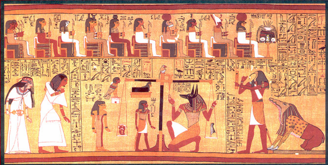
One work in particular that caught my eye in Tuesday's class this week was the Vignette from the Papyrus of Ani. Which is a piece found within the book of the dead. I did a bit of research on this piece to get a better understanding of what exactly is going on.
According to http://www.egyptartsite.com/ani.html, this series depicts the Egyptian ritual of mummification. In particular for this piece, it was for the royal scribe, Ani. Since, after death, the person was supposed to travel to the afterlife after they died. The body was an important part to this process, so they had to preserve it for eternity in order for the person to be able to successfully travel to the afterlife.
Now onto the main topic at hand. You'll notice there is a figure close to the center bottom on the left side that has a jackal shaped head. That is Anubis, also known as the Guardian of the Afterlife. Anubis actually has been used several times in our current culture. Hell, they've even used him in a few movies and video games.
But the sad part about this is that usually when something is taken from the past and recreated into something for present media, the people who recreate it usually change what the icon formerly was and make it into something that it wasn't. Anubis has been made into an antagonist at times and although he's still given the job of dealing with the afterlife, he's sort of made out to be this bad guy. When really, the Egyptians honored and respected him.
If anything, I'd sort of like to relate this to Hades who was, in Greek mythology, the ruler of the Underworld. Now, as some people might know, Disney created a movie called Hercules. This movie depicted Hades as a bad guy. Funny enough, Hades wasn't really all that bad. If you want a real shocker, you should read up on Zeus. You'll definitely see him in a new light after you read up on what really happened.
Point is, it seems over the years, different iconic characters start to develop different backgrounds if one generation is inspired by another. This isn't always a bad thing, but it is sort of a shame since the old icon starts to lose it's meaning. But, I suppose that just gives people all the more reason to research the history of certain subjects.
Subscribe to:
Posts (Atom)


